การเลือกสีในงานเซรามิกไม่ใช่แค่เรื่องสวยงาม แต่คือหัวใจสำคัญของการถ่ายทอดอารมณ์และตัวตนของแบรนด์ ไม่ว่าคุณจะเป็นนักออกแบบมือใหม่ หรือเจ้าของแบรนด์ที่ต้องการสร้างจาน ชาม หรือแจกันที่โดดเด่น โทนสีคือสิ่งแรกที่คนจดจำ
บทความนี้จะพาคุณเข้าใจ พื้นฐานของการเลือกโทนสี (Color Palette Fundamentals) ในโลกของเซรามิก โดยเน้น 3 ประเด็นหลัก:
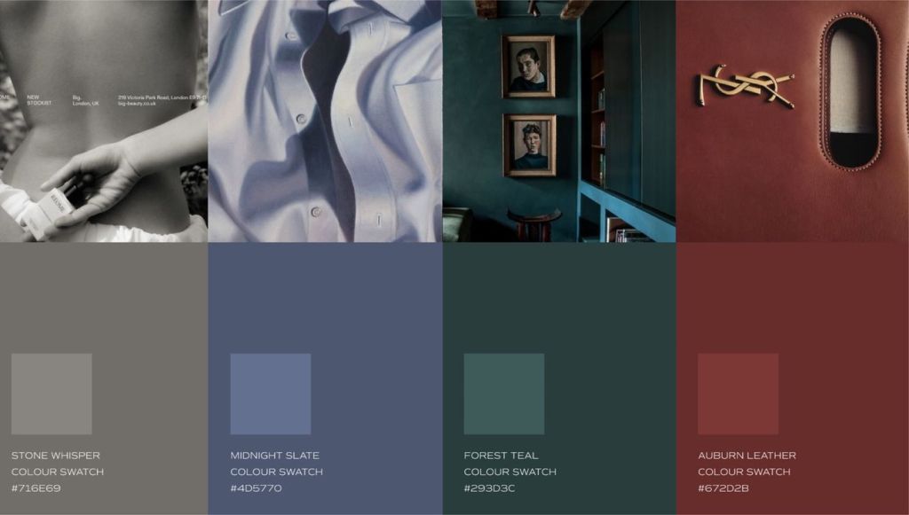
1. โทนร้อน (Warm Tones) vs โทนเย็น (Cool Tones)
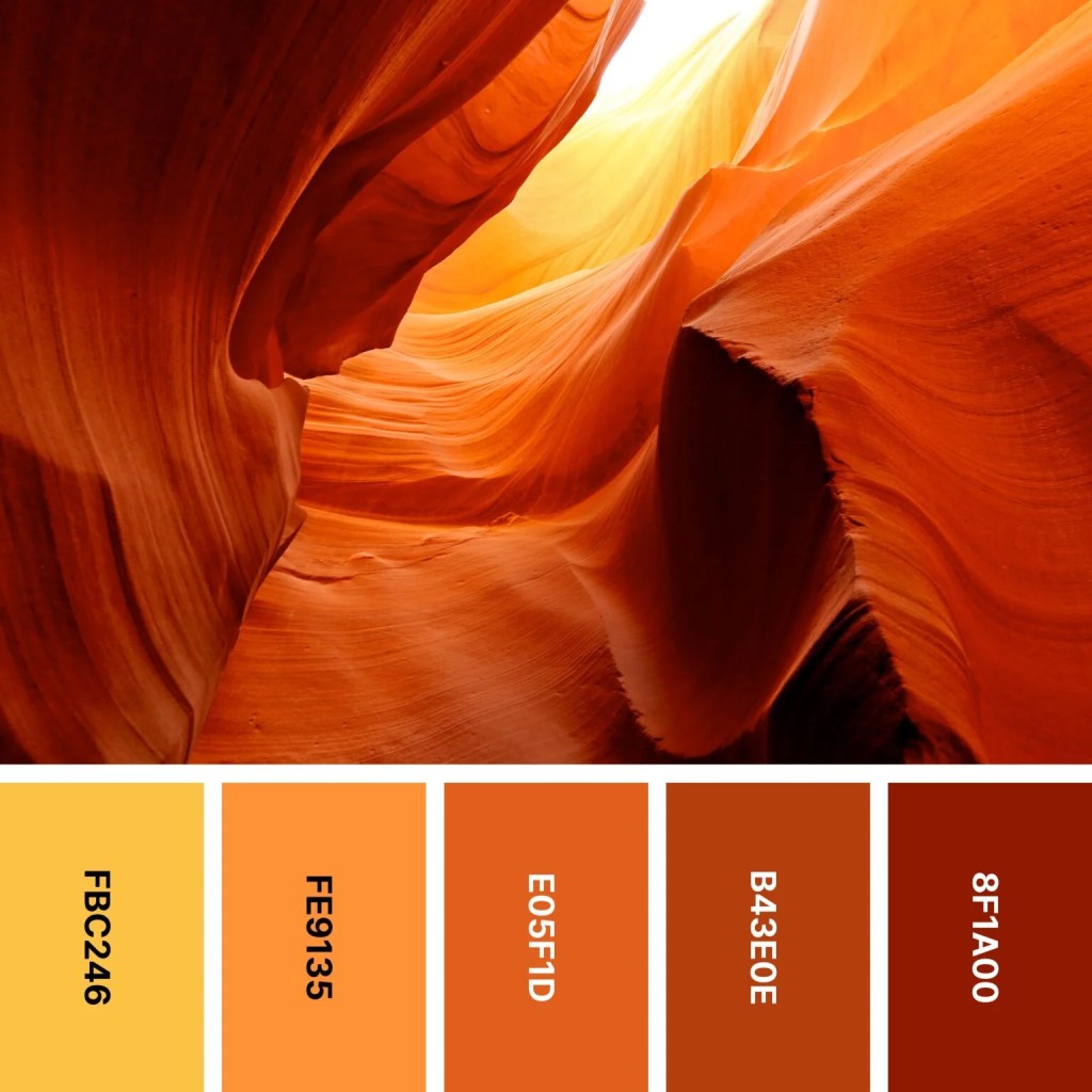

Warm Tones เช่น สีแดง ส้ม เหลือง และน้ำตาลอิฐ ให้ความรู้สึกอบอุ่น เป็นกันเอง ใช้บ่อยกับงานเซรามิกแนว rustic หรือ handmade ที่อยากให้ความรู้สึก “ใกล้ชิดธรรมชาติ”
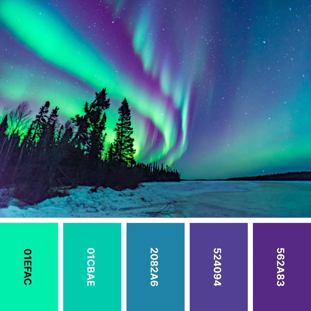
Cool Tones เช่น สีฟ้า เขียว เทา และน้ำเงิน ให้ความรู้สึกสงบ เรียบ หรูหรา และทันสมัย เหมาะกับสไตล์โมเดิร์น มินิมอล หรือสินค้าที่อยากสะท้อนความเรียบง่ายแต่ดูดี
2. Earth Tones vs Luxury Contrast
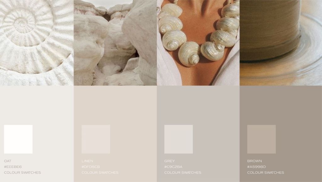
Earth Tone Ceramics คือโทนสีจากธรรมชาติ เช่น ดิน ทราย หิน ใบไม้ ให้ความรู้สึก organic, grounded, และ authentic เป็นที่นิยมในงาน craft หรือสินค้าทำมือ เพราะทำให้ผู้ใช้รู้สึกเชื่อมโยงกับธรรมชาติ

Luxury Contrast หมายถึงการใช้สีแบบคอนทราสต์ เช่น ทอง-ดำ, น้ำเงินเข้ม-ขาว หรือเขียวเข้ม-ครีม เพื่อสร้างภาพลักษณ์ “หรูหราแต่เรียบง่าย” เป็นโทนที่เหมาะกับเซรามิกที่เน้นงานดีไซน์ หรือทำตลาดระดับพรีเมียม
3. ความกลมกลืนของ Clay Body และ Glaze
ในโลกของเซรามิก ไม่ใช่แค่การเลือกสีน้ำเคลือบ (glaze) เท่านั้น แต่ต้องเข้าใจว่า สีของเนื้อดิน (clay body) มีผลต่อเฉดสุดท้ายหลังเผา เช่น:
- ดินขาว (white clay) ทำให้สีออกมาชัด สว่าง เหมาะกับโทนพาสเทล หรือโทนหรู
- ดินแดง/ดินเข้ม (dark clay) ให้โทนอบอุ่น หนักแน่น ใช้คู่กับ glaze ด้านหรือสีธรรมชาติได้ดี
การจับคู่ดินกับเคลือบให้ถูก จะช่วยให้งานออกมามีมิติ กลมกลืน และส่งเสริมแนวคิดของสินค้าอย่างแท้จริง
สรุป
Color Palette คือภาษาลับของเซรามิก ที่สื่อสารอารมณ์ แบรนด์ และความรู้สึกต่อผู้ใช้ได้อย่างทรงพลัง
หากคุณเข้าใจว่าโทนไหนเหมาะกับงานแบบใด และรู้จักจับคู่ดินกับน้ำเคลือบอย่างลงตัว งานเซรามิกของคุณจะดู “มีชีวิต” และแตกต่างอย่างแท้จริง
Read English version
Color Palette in Ceramics: Warm vs Cool Tones, Earth Tones vs Luxury Contrast, and Clay–Glaze Harmony
Choosing a color palette in ceramics isn’t just about what looks beautiful — it’s the heart of how your brand tells its story and expresses emotion. Whether you’re a new designer or a brand owner creating plates, bowls, or vases, color is often the first thing people remember.
This article breaks down the fundamentals of color palettes in ceramics, focusing on 3 key ideas:
1. Warm Tones vs Cool Tones

Warm Tones – like reds, oranges, yellows, and terracotta – give off a cozy, welcoming feeling. They’re often used in rustic or handmade ceramics that aim to feel “close to nature.”
Cool Tones – such as blues, greens, grays, and navy – feel calm, sleek, luxurious, and modern. These are perfect for minimalist styles or products that reflect elegance and simplicity.
2. Earth Tones vs Luxury Contrast

Earth Tone Ceramics draw from nature’s palette — clay, sand, stone, leaves. They give an organic, grounded, and authentic feel. These tones are popular in handcrafted goods because they help users feel connected to nature.
Luxury Contrast means using bold color pairings like black-gold, navy-white, or deep green-cream to create a “refined yet striking” look. These palettes are ideal for premium, design-focused ceramic collections.
3. Clay Body & Glaze Harmony
In ceramics, it’s not just about choosing a glaze color — the clay body underneath affects the final result after firing.
- White clay enhances brighter, cleaner glaze colors, making it great for pastel or elegant tones.
- Red or dark clay brings warmth and depth. It pairs beautifully with matte glazes or earthy shades.
When the clay and glaze are thoughtfully matched, the result feels more cohesive, dimensional, and true to your brand’s message.
Summary
Color palettes are the secret language of ceramics — they communicate emotion, identity, and energy.
By understanding which tones fit your design and how to pair clay with glaze, your ceramic pieces can come alive with meaning and stand out with true personality.

Leave a comment