RGB, CMYK, Pantone คืออะไร? แล้วเกี่ยวอะไรกับงานเซรามิก?
เคยไหม? เห็นสีบนหน้าจอสวยมาก แต่พอสั่งพิมพ์ หรือทำเป็นถ้วยเซรามิกจริงๆ กลับ สีเพี้ยน นั่นเพราะสีที่เราเห็นและสีที่เราผลิตใช้ “ระบบคนละภาษา”
วันนี้เราจะพาไปรู้จัก 3 ระบบสีหลักของโลก และวิธีเลือกใช้ให้เหมาะกับ งานเซรามิก หรือ ออกแบบสินค้า แบบมืออาชีพ
1. 🌈 รู้จัก 3 ระบบสีหลักที่ต้องเข้าใจ
✅ RGB: ใช้บนหน้าจอ
- เหมาะกับ: เว็บไซต์, โซเชียลมีเดีย, ภาพสินค้า
- หลักการ: ผสมแสงสีแดง เขียว น้ำเงิน → ได้สีที่สว่างขึ้น
- หมายเหตุ: สีจะดู “สดใสเกินจริง” เพราะหน้าจอมีแสงในตัว
✅ CMYK: ใช้สำหรับงานพิมพ์
- เหมาะกับ: แพ็กเกจ กล่อง แคตตาล็อก
- หลักการ: ผสมหมึก 4 สี (ฟ้า, ม่วงแดง, เหลือง, ดำ)
- หมายเหตุ: ทำสีนีออนหรือสีสว่างสดๆ ไม่ได้เหมือน RGB
✅ Pantone (PMS): ใช้สำหรับงานที่ต้องการ “สีตรงเป๊ะ”
- เหมาะกับ: งานพิมพ์คุณภาพสูง, แฟชั่น, เคลือบเซรามิก
- หลักการ: ใช้ “รหัสเฉพาะ” ของสี เช่น Pantone 18-1659
- ข้อดี: ถ้าใช้รหัสเดียวกัน ทั่วโลกก็ได้สีเดียวกัน
2. 🏺 แล้วระบบสีเกี่ยวอะไรกับเซรามิก
ในงานเซรามิก สีจริงที่ได้หลังเผา อาจไม่เหมือนที่ออกแบบไว้เลย เพราะ…
🔥 อุณหภูมิสูง: ทำให้แร่บางชนิดเปลี่ยนสีหรือระเหย
🧱 ดินต่างกัน: สีเดียวกัน ถ้าเคลือบบนดินสีขาว vs ดินสีแดง ก็ออกมาต่างกัน
🧪 เคมีของเคลือบ (Glaze): แต่ละสูตรมีผลกับการเปลี่ยนสีอย่างมาก
3. Professional Color Naming: การเรียกชื่อสีแบบมืออาชีพ
ในวงการเซรามิกหรืองานออกแบบระดับสากล การบอกว่าขอสีฟ้านั้นไม่เพียงพอ มืออาชีพจะใช้วิธีเรียกชื่อเพื่อให้เข้าใจตรงกันดังนี้:
- ใช้ Pantone Code: แม้เซรามิกจะผสมสีเป๊ะๆ ตาม Pantone ได้ยาก แต่การอ้างอิง Pantone จะช่วยให้ช่างเซรามิก “เทียบสี” (Color Matching) ได้ใกล้เคียงที่สุด
- อ้างอิงจากแร่ธาตุ (Oxide Names): ช่างเซรามิกมักเรียกสีตามสารที่ให้สีนั้นๆ เช่น:
- Cobalt Blue: สีน้ำเงินเข้มจากแร่โคบอลต์
- Celadon: สีเขียวไข่กา (เอกลักษณ์ของศิลาดล)
- Oxblood: สีแดงก่ำเหมือนเลือดวัว (เกิดจาก Copper Oxide)
- Descriptive Names + Finish: การระบุผิวสัมผัสควบคู่ไปกับชื่อสี เช่น
- Matte Mustard Yellow (สีเหลืองมัสตาร์ดแบบด้าน)
- Glossy Midnight Blue (สีน้ำเงินเข้มแบบเงา)
💡 สรุป: เลือกใช้ระบบไหนดี?
- ใช้ RGB สำหรับเว็บและภาพถ่ายสินค้า
- ใช้ CMYK สำหรับงานพิมพ์ เช่น กล่อง/ฉลาก
- ถ้าจะส่งงานให้โรงงานผลิตเซรามิก ควรระบุเป็น Pantone เพื่อเป็นตัวกลาง
และที่สำคัญอย่าลืมทำ Test Tile (ชิ้นทดสอบเผา) เสมอ เพราะในเตาเผาคือตัวกำหนดสีที่แท้จริง
Read English version
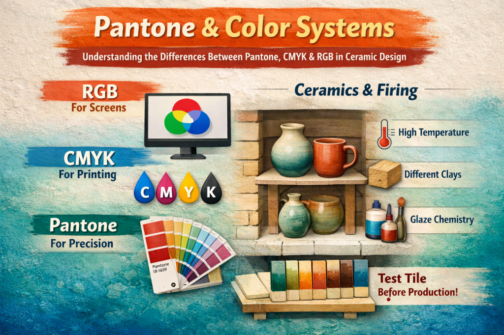
Pantone & Color Systems: Understanding the Differences Between Pantone, CMYK, and RGB in Ceramic Design
🎨 RGB, CMYK, Pantone: What Are They, and How Do They Relate to Ceramics?
Ever noticed how a color looks perfect on your screen, but once printed or applied to a ceramic piece — it turns out completely different? That’s because colors “speak different languages” depending on where and how they’re used.
Today, let’s explore the 3 main color systems used around the world and how to choose the right one — especially when working with ceramics or product design.
🌈 1. Understanding the 3 Main Color Systems
✅ RGB – For Digital Screens
- Used for: Websites, social media, product photos
- How it works: Combines Red, Green, and Blue light → the more light added, the brighter the color
- Note: RGB colors appear more vibrant because screens emit light
✅ CMYK – For Print
- Used for: Packaging, catalogs, printed labels
- How it works: Combines four ink colors – Cyan, Magenta, Yellow, and Black
- Note: Can’t produce bright neon colors like RGB
✅ Pantone (PMS) – For Precise Color Matching
- Used for: High-end printing, fashion, and ceramic glazing references
- How it works: Each color has a unique code (e.g. Pantone 18-1659), like choosing a paint swatch
- Why it’s useful: The same Pantone code delivers the same color globally
🏺 2. What Does Color Have to Do with Ceramics?
In ceramics, the final color after firing often looks nothing like the original sample. That’s due to several factors:
- 🔥 High heat: Some minerals burn off or change color under high temperatures
- 🧱 Clay body: The same glaze will look different on white vs. red clay
- 🧪 Glaze chemistry: Each glaze formula reacts differently in the kiln
🎨 3. Professional Color Naming in Ceramics
In design or ceramics, saying “I want blue” isn’t specific enough. Professionals use detailed naming methods to ensure clarity:
✔ Ways to Communicate Color Like a Pro:
1. Use Pantone Codes
Even if you can’t replicate Pantone shades exactly in ceramics, referencing the code helps with color matching as closely as possible.
2.Reference Oxides (Minerals)
Many ceramic colors are named after the minerals that produce them:
Cobalt Blue – deep blue from cobalt
Celadon – classic pale green from traditional celadon glaze
Oxblood – rich red from copper oxide
3.Add Texture + Tone Descriptions
For example:
- Matte Mustard Yellow
- Glossy Midnight Blue
This describes both the color and the surface finish
💡 Summary: Which Color System Should You Use?
- Use RGB for websites and product photography.
- Use CMYK for printed materials such as packaging or labels.
- If you’re working with a ceramic manufacturer, provide a Pantone code as a common reference.
And most importantly — always create a test tile before full production, because the final color is ultimately determined inside the kiln.

Leave a comment