เมื่อพูดถึงเซรามิก หลายคนมักนึกถึง “รูปทรง” หรือ “สีสัน” แต่ในโลกของการขาย โดยเฉพาะออนไลน์ “พื้นผิว” หรือ Surface Finish คือสิ่งสำคัญที่อธิบายคุณภาพ ความรู้สึก และมูลค่าของสินค้าได้ทันทีตั้งแต่แรกเห็น
บล็อกนี้จะพาคุณเข้าใจเรื่องของพื้นผิว (Matte vs Gloss), ความลึกของเคลือบ (Depth), ความทึบ/ใส (Opacity) และวิธีนำเสนอสิ่งเหล่านี้ผ่านภาพถ่ายสินค้า เพื่อดึงดูดใจลูกค้า
1. พื้นผิว Matte vs Glossy ต่างกันยังไง?
Matte (แมตต์)
- ผิวสัมผัสด้าน ไม่สะท้อนแสง
- ให้ความรู้สึกอุ่น ละมุน ดิบ เรียบง่าย
- เหมาะกับงานแนวมินิมอล ธรรมชาติ หรือ Artisan look
- ถ่ายภาพยากกว่าเล็กน้อย เพราะไม่เล่นกับแสง
Glossy (เงา)
- สะท้อนแสงสูง ดูแวววาว
- ให้ความรู้สึกหรูหรา ล้ำสมัย หรือน่าสัมผัส
- เหมาะกับงานที่ต้องการให้สี “สด” หรือโชว์ลวดลายชัดเจน
- ถ่ายภาพให้ดีต้องควบคุม reflection ไม่ให้แสงสะท้อนแรงเกิน
🎯 เคล็ดลับการถ่ายภาพสินค้า: ใช้ไฟนุ่ม (soft light) และแผ่นสะท้อนช่วยควบคุมแสง เพื่อให้พื้นผิวดูชัดโดยไม่สะท้อนจ้า
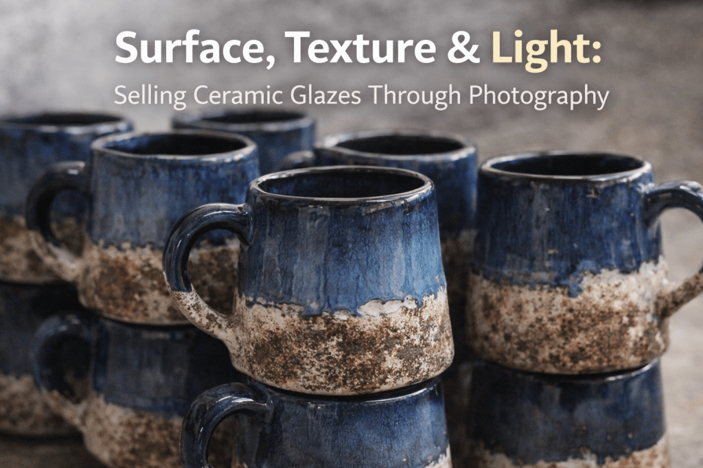
2. Depth: ความลึกของสีและชั้นเคลือบ
เซรามิกบางชิ้นแค่เคลือบชั้นเดียวสีดูแบน แต่บางชิ้นกลับดูมี “มิติ” เหมือนมีชั้นสีแทรกซ้อนอยู่ นี่คือ “ความลึก” ที่สร้างได้จากเทคนิคเคลือบหลายชั้น หรือการใช้ “glaze ที่มี texture” ในตัว
- เคลือบ 2 ชั้น (Layered Glaze): เช่น ด้านล่างเป็นครึ่งด้าน-ครึ่งเงา ด้านบนเป็นเคลือบไหล เกิดเป็นลวดลายเฉพาะ
- เคลือบมี texture: เช่น มีจุด มีคราบ มีเส้นไหล สร้างเอกลักษณ์
- เทคนิค reduction หรือ wood-firing ที่ทำให้สีและผิวดูมีชีวิต
🔍 ภาพถ่ายที่ดีควรเน้น texture ด้วยแสงเฉียง (sidelight) เพื่อให้ผิวและมิติสว่าง/มืดต่างกันแบบธรรมชาติ
3. Opacity: ทึบแสงหรือโปร่งแสง?
- Opaque Glaze (เคลือบทึบ)
ปิดเนื้อดินมิด ไม่เห็นลวดลายหรือ texture ใต้ผิว
เหมาะกับลวดลายเรียบๆ สีเข้ม- Translucent Glaze (เคลือบโปร่งแสง)
เผยให้เห็น texture ใต้ผิวดิน เช่น ลายขูด ลายปั้น
เหมาะกับงาน fine detail หรือเซรามิกหัตถกรรม4. ขายเคลือบผ่าน “ภาพถ่าย” ให้ได้ผล
แม้ลูกค้าจะจับของจริงไม่ได้ แต่ภาพถ่ายที่ดีสามารถ:
✅ สื่ออารมณ์ของพื้นผิว เช่น ละมุน หรู ดิบ เท่
✅ แสดงคุณภาพของสินค้า เช่น ความหนาแน่นของเคลือบ
✅ ช่วยให้เข้าใจขนาดและการใช้งาน เช่น ถ้วยนี้เหมาะกับอะไร?💡 เทคนิคเสริม:
- ถ่าย macro ชัดลายเคลือบ
- แสงเฉียง + ฉากหลังกลาง (neutral) เพื่อเน้นผิวจริง
- ใช้แสงธรรมชาติหรือลงแต่งภาพเล็กน้อย (อย่าเกินจริง)
สรุป
“พื้นผิว” (Surface), “แสงเงา” (Light) และ “ผิวสัมผัส” (Texture) ไม่ใช่แค่เรื่องศิลปะ แต่มันคือสิ่งที่แบรนด์เซรามิกต้องเรียนรู้ เพราะนั่นคือสิ่งแรกที่ลูกค้า “เห็น” และ “รู้สึก” ได้จากภาพ
หากคุณกำลังขายเซรามิกทั้งบนเว็บหรือแพลตฟอร์มอย่าง Etsy, Shopee, หรือ Amazon การสื่อสารเรื่องพื้นผิวและความรู้สึกผ่านรูปภาพให้ดีเท่ากับเพิ่มโอกาสปิดการขายได้สูงขึ้น
Read English version
🌟 Surface, Texture & Light: Selling Ceramic Glazes Through Photography
When it comes to ceramics, most people think of form or color, but in the world of product marketing—especially online—surface finish plays a key role. It instantly communicates quality, emotion, and value before the customer even touches the piece.
This blog will walk you through the basics of Matte vs Glossy, Color Depth, Opacity, and how to showcase these qualities through product photos that sell.
1. Matte vs Glossy: What’s the Difference?
Matte Finish
- Soft, non-reflective surface
- Feels warm, raw, natural, or minimalist
- Ideal for earthy or artisan-style pieces
- Slightly harder to photograph due to lack of light play
Glossy Finish
- Highly reflective, shiny surface
- Feels luxurious, modern, or tactile
- Great for vibrant colors and intricate patterns
- Must manage reflections carefully in photos
🎯 Photography Tip: Use soft light and a reflector to highlight surface texture without creating harsh glare.
2. Depth: How Layering Creates Richer Glazes
Some ceramic pieces feel “flat,” while others look full of dimension—as if layers of color and glaze are stacked and melting into one another. This depth often comes from glaze layering or built-in glaze textures.
- Layered Glazes: E.g., matte base + glossy drip on top = one-of-a-kind pattern
- Textured Glazes: Spots, streaks, runs—all add uniqueness
- Special Firing: Reduction or wood firing creates movement and life in the surface
🔍 Photo Tip: Use sidelight to enhance texture and natural contrasts between light and shadow.
3. Opacity: Opaque vs Translucent Glazes
Opaque Glaze
- Fully covers the clay
- Ideal for bold, solid colors or clean surfaces
- Hides any carved or textured detail underneath
Translucent Glaze
- Lets the base texture or carved designs show through
- Perfect for fine detailing and handcrafted looks
4. Selling Glazes Visually (With Just a Photo!)
Even when your customers can’t touch the product, a great photo can:
✅ Convey the feeling of the surface—whether soft, shiny, or rugged
✅ Showcase the quality and density of the glaze
✅ Help customers understand use or scale—Is this cup for coffee or sake?
💡 Tips for Better Product Photography:
- Use macro shots to zoom in on the glaze
- Choose a neutral background to avoid distractions
- Use natural light or edit gently (don’t oversaturate or mislead)
🔚 Final Thoughts
Surface, light, and texture aren’t just artistic choices—they’re part of your brand’s visual language. They’re what customers see and feel first through your photos.
Whether you’re selling on Etsy, Shopee, Amazon, or your own website, investing in visual storytelling through surface and glaze details can significantly boost conversion and customer confidence.

Leave a comment