
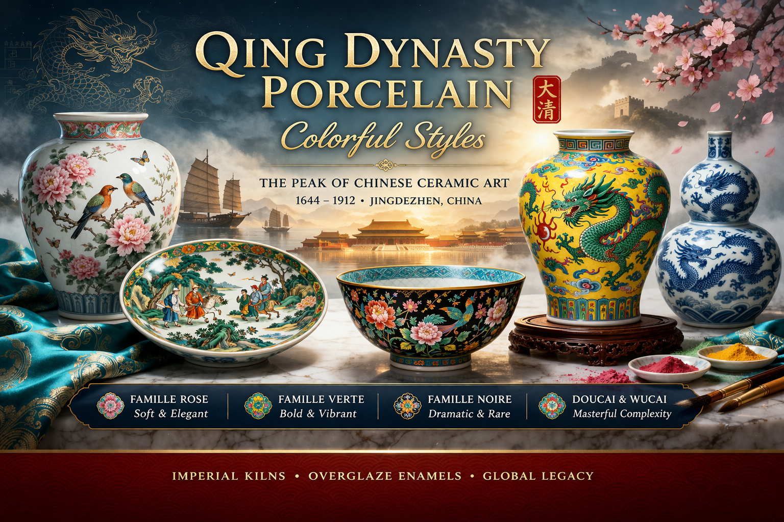
เครื่องลายครามในสมัย ราชวงศ์ชิง (ค.ศ. 1644–1912) ถือเป็นจุดสูงสุดของการพัฒนาเซรามิกจีน โดยเฉพาะในด้าน การใช้สี (polychrome decoration) และเทคนิคการเคลือบที่ซับซ้อน
ในยุคนี้ การผลิตไม่ได้เป็นเพียงงานหัตถกรรม แต่เป็น ระบบการผลิตระดับจักรวรรดิ (imperial system) ที่ผสานศิลปะ วิทยาศาสตร์ และการควบคุมคุณภาพอย่างเข้มงวด
ศูนย์กลางหลักยังคงอยู่ที่ จิ่งเต๋อเจิ้น (Jingdezhen) ซึ่งทำหน้าที่เป็นทั้งโรงงานหลวงและศูนย์กลางการส่งออกของโลก
การเปลี่ยนผ่านสู่ยุคแห่งสี
ในสมัยก่อนหน้า เช่น ราชวงศ์หมิง เครื่องลายครามเน้นความงามของ สีน้ำเงิน-ขาว (blue-and-white) เป็นหลัก
แต่ในสมัยชิง ได้เกิดการพัฒนาเทคนิค overglaze enamels ซึ่งเปิดโอกาสให้ศิลปินสามารถใช้สีได้หลากหลายมากขึ้น เช่น
- ชมพู
- เขียว
- เหลือง
- ม่วง
- ดำ
การพัฒนานี้เปลี่ยนเครื่องลายครามจาก “งานลวดลาย” ไปสู่ “งานภาพวาดบนเซรามิก”
เทคนิค: Overglaze Enamel
หัวใจสำคัญของความก้าวหน้าคือเทคนิคการลงสี หลังการเผาครั้งแรก
กระบวนการ
- เผาเนื้อพอร์ซเลนและเคลือบใสก่อน
- ลงสี enamel บนผิวเคลือบ
- เผาซ้ำที่อุณหภูมิต่ำ
ผลลัพธ์
- สีสดและหลากหลาย
- ควบคุมโทนสีได้ละเอียด
- วาดรายละเอียดระดับ “จิตรกรรม” ได้
เทคนิคนี้ทำให้เครื่องลายครามกลายเป็น สื่อศิลปะเต็มรูปแบบ
กลุ่มสีหลัก (Color Systems)
1. Famille Verte (ยุคคังซี)
- ใช้สีเขียวเป็นหลัก
- โทนสีสดและ contrast สูง
- ลวดลายชัดเจน แข็งแรง
สะท้อนความมั่นคงและพลังของรัฐในช่วงต้นราชวงศ์

2. Famille Rose (ยุคหย่งเจิ้ง – เฉียนหลง)
- ใช้สีชมพูจาก enamel ที่มีทองเป็นส่วนผสม
- โทนสีนุ่ม ไล่เฉดได้ละเอียด
- ลวดลายละเอียดมาก เช่น ดอกไม้ นก ฉากชีวิต
ถือเป็นจุดสูงสุดของ “ความละเอียดทางศิลปะ”

3. Famille Noire
- พื้นหลังสีดำ
- สีสันตัดกันอย่างรุนแรง
- มีความ dramatic และหรูหรา
พบได้น้อย ทำให้มีมูลค่าสูง

4. Wucai & Doucai
- การใช้หลายสีร่วมกัน
- ผสม underglaze + overglaze
- ต้องใช้ความแม่นยำสูง
แสดงถึงความสามารถทางเทคนิคขั้นสูงของช่าง

บริบททางจักรวรรดิ
ในราชวงศ์ชิง การผลิตเครื่องลายครามถูกควบคุมโดยราชสำนัก
- มีการกำหนดแบบ (design control)
- มีมาตรฐานคุณภาพ
- ใช้เป็นเครื่องแสดงอำนาจ
ลวดลาย เช่น
- มังกรห้าเล็บ → จักรพรรดิ
- สีเหลือง → ราชสำนัก
👉 เครื่องลายครามจึงเป็นทั้ง “ศิลปะ” และ “สัญลักษณ์อำนาจ”
การค้าและโลกาภิวัตน์ยุคต้น
เครื่องลายครามชิงเป็นสินค้าส่งออกสำคัญไปยัง:
- ยุโรป
- ตะวันออกกลาง
- เอเชียตะวันออกเฉียงใต้
ความต้องการจากยุโรปนำไปสู่การผลิตแบบ
Export porcelain
บางชิ้นมีลวดลายแบบยุโรป เช่น coat of arms
การตีความเชิงศิลปะ
เครื่องลายครามชิงไม่ได้เน้นเพียงความสมมาตร แต่เน้น:
- การเล่าเรื่อง (narrative scenes)
- การใช้สีเพื่อสร้างอารมณ์
- การควบคุมพื้นที่ว่าง
เป็นการผสมระหว่าง fine art + craft + design
บทสรุป
เครื่องลายครามราชวงศ์ชิงคือจุดสูงสุดของการพัฒนาเซรามิกโลก
ด้วยการผสมผสานระหว่าง
เทคนิคขั้นสูง สีสันที่หลากหลาย และการควบคุมระดับจักรวรรดิ
ทำให้ผลงานในยุคนี้ยังคงเป็นมาตรฐานของความงามและความซับซ้อนในงานเซรามิกจนถึงปัจจุบันะและการใช้งานอย่างลึกซึ้ง
Read English version
Qing Dynasty Porcelain: Colorful Styles

Qing dynasty porcelain (1644–1912) represents the pinnacle of Chinese ceramic development, particularly in the use of polychrome decoration and overglaze enamel techniques.
Production during this period was not merely artisanal, but part of a highly organized imperial system, combining artistic excellence with strict quality control.
The primary production center was Jingdezhen, the imperial kiln site and global hub for porcelain export.
The Shift to Color
Earlier periods, such as the Ming dynasty, emphasized blue-and-white porcelain. In contrast, the Qing dynasty saw the expansion of multi-colored enamel decoration, transforming porcelain into a painting-like medium.
Technique: Overglaze Enamels
The defining innovation was the use of overglaze enamels:
- Initial firing of porcelain body and glaze
- Application of enamel pigments
- Second low-temperature firing
This allowed:
- A wider color palette
- Greater tonal control
- Highly detailed imagery
Major Color Families
Famille Verte (Kangxi period)
- Dominant green palette
- Strong contrast and bold outlines
Famille Rose (Yongzheng–Qianlong)
- Soft pink tones (gold-based enamel)
- Highly refined and detailed
Famille Noire
- Black background with vivid colors
- Rare and dramatic
Wucai & Doucai
- Multi-color combinations
- Complex layering techniques
Imperial Context
Porcelain production was tightly controlled by the imperial court:
- Standardized designs
- Symbolic motifs (dragons, imperial colors)
- Strict quality regulation
Porcelain functioned as both art and political symbolism
Global Trade
Qing porcelain was widely exported across:
- Europe
- The Middle East
- Southeast Asia
This led to the development of export porcelain, often tailored to foreign markets.
Artistic Interpretation
Qing porcelain integrates:
- Narrative imagery
- Color-based expression
- Spatial composition
It represents a fusion of fine art, craftsmanship, and design
Conclusion
Qing dynasty porcelain stands as one of the most sophisticated ceramic traditions in history, combining technical mastery, artistic depth, and global influence.
Leave a Reply